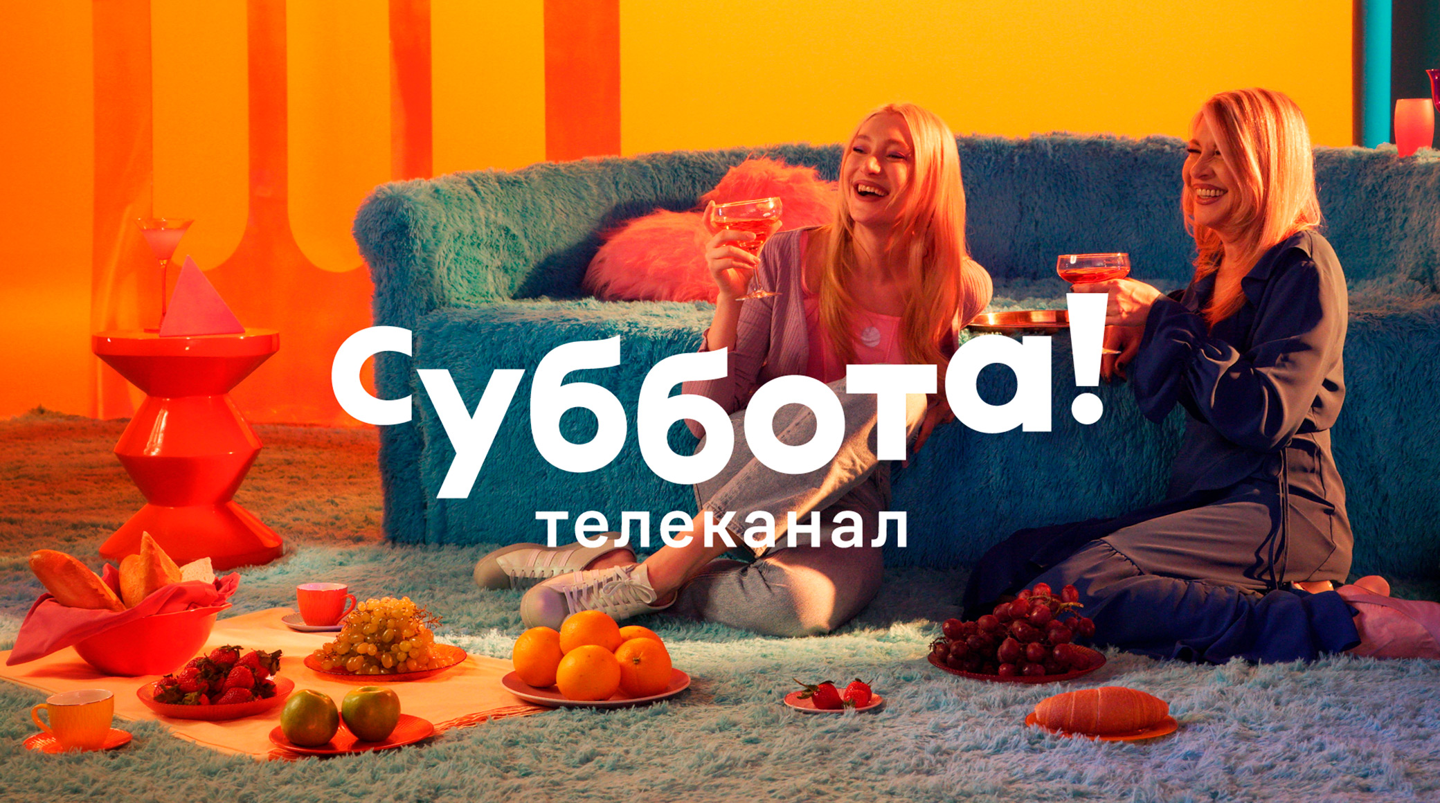
The Saturday! entertainment channel for energetic young women and the men in their lives started broadcasting today in place of the Super channel, and it also unveiled its brand identity, developed by the team of Friday! TV channel together with the BBDO Branding agency and Pinery production studio.
The main elements of the channel’s identity are relaxation, a sense of lightness, rest and pleasure. These align perfectly with the programming on Saturday! cult TV shows, popular reality shows, movies and entertainment news.
Levitating logo
Saturday! has a typographic logo with unique, specially designed lettering. The line of the logo is slightly curved; the letters levitate, and there is a lot of space between them. The logo can transform and change depending on the screen: it can be horizontal or vertical, centered or placed on the side.
Gradients and corporate colors
The color scheme for Saturday! uses gradients: magenta and orange are the main colors, with complementary elements in blue, violet and light green. The gradient and the variety of colors reflect the diversity of the channel’s content, its personalities and the treats that await viewers when they turn on Saturday! and devote the day to themselves.
Bold fonts
When it comes to fonts, Saturday! brings together two polar opposites: the cheeky, compressed Theodor from stylish, Berlin-based type designer Philipp Neumeyer and the simple CoFo Sans. Combined, the two fonts are a balance between simplicity and individuality.
ID
The TV channel has prepared a series of image videos together with the Pinery production studio. They are made in a “surreal glamour” style, and creating the atmosphere of a glamorous bachelorette party with a touch of the absurd.
